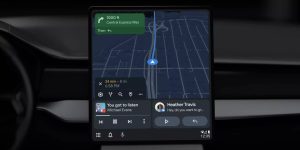
Google is making the previously announced Android Auto redesign available to everyone. Users thus have an adaptive dashboard at their disposal, where a split-screen layout allows the display of multiple apps side by side.
This innovation makes it possible to see the navigation window in the left part of the infotainment screen of the car, with the music or podcast app in the right part, which also has a progress bar. A third panel can be added to the right side, namely a communication window that can display notifications and reminders and, for example, shows messages that can also be responded to. Google Assistant can also display suggestions such as reminders there. Soon it will also be possible for the most recent Pixel and Samsung smartphones to make WhatsApp calls via Android Auto.
Previously, Android Auto prioritized either the media player or the navigation app, pushing the other down and keeping it in the form of a status bar. With the redesign, for example, a new podcast episode can be chosen, without the Google Maps view ‘disappearing’. It is still possible to show only one panel if users feel that having multiple panels on screen at the same time is too distracting.
As part of the redesign, the bar at the bottom of the screen is still there, where recently used apps can be found. According to Google, the new split-screen layout can be used in cars from all major car manufacturers, partly because the layout can be adjusted based on the screen size and orientation of the screen. The new design has been in beta for a while and will be available from Thursday, although it may take a while for everyone to receive the update.

